Popular Taylor Swift Songs Share Words with Other Taylor Swift Songs

What makes a Taylor Swift song popular? Several answers could come to mind: the poetic beauty of her songwriting, the deft skill of her producers, the power of the bridge, her emotive vocal performance. Certainly, these matter. But each of these answers is also limited because each focuses on the characteristics of one song in isolation. My semantic analysis of Taylor Swift’s lyrics suggests a different kind of answer: A Taylor Swift song’s popularity arises from its connection to other Taylor Swift songs.

I’ll discuss the data supporting that claim in a moment, but I want to do so by way of something I’ve never written about here: My own story of how I became a Swiftie.

My journey into the Taylorverse

In my childhood, I listened to a number of female country artists, and in my mid-twenties, I enjoyed singers that were, at the time, also catering to a similar audience as Taylor Swift (Hilary Duff, Aly & AJ, Miley Cyrus). That was good preparation, and although I can’t pinpoint the first time I heard Taylor, it was probably on the radio or on Yahoo’s music streaming service.

I do know that, in June 2009, I was driving down New Hampshire St. in Lawrence, Kansas. I was on a business trip as a young assistant professor, attending a weeklong seminar on advanced social science statistics. “Love Story” came on the radio. It wasn’t the first time I’d heard the song, but I remember thinking to myself, “Yeah, this is good stuff—I could be a Taylor Swift fan.” That’s the point when I’d say my journey into the Taylorverse began.

Later, I bought a used copy of Fearless, then Speak Now, then debut, and then I bought Red when it was a new release. As I listened, I began to appreciate that Taylor wasn’t writing just songs; she was writing albums. That’s maybe not the case with debut, which feels like a (very good) group of songs, but in Fearless and especially Speak Now, it was becoming evident that her albums were cohesive artistic statements as a whole. Fearless celebrates the closeness and challenges of teenage girls’ relationships; Speak Now is about finding one’s voice in the journey of growing up. By Red, a tour de force of romantic passion and heartbreak, the deeply thematic nature of her albums was undeniable. Yes, the songs matter; but the song’s context, what we would now call its era, deeply shapes her work.

Then, moving into 1989 and Reputation and beyond, I realized the connections weren’t only within albums, but between them. “A circus ain’t a love story” ties Reputation to Fearless. “Blank Space” wryly caricatures her media persona in her early albums. “I once believed love would be burning red,” she sings in Lover’s “Daylight.” Then “Bad Blood” is playing in a cab on Folklore, and then “You’re on Your Own, Kid” summarizes her entire career… you get the idea, and there are so many other examples.

To call these lyrical connections “Easter eggs” is a bit too trite. Perhaps these connections are more than a bonus for astute fans, but rather part of the fabric—the ‘invisible string,’ if you will—that unites the art. That’s what my research tried to examine quantitatively.

Which Taylor Swift songs have the most word overlap with other songs?

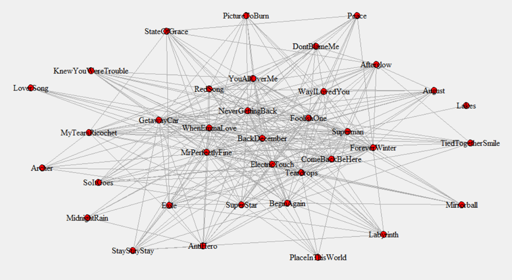
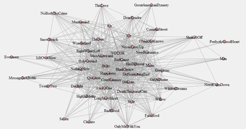
In the previous post, I described how 13 shared words is the minimum threshold where it made sense to treat two Taylor Swift songs as connected. Of course, the more words in common, the stronger the connection. We can use that information to create a map of the links between songs (again, discussed in the last post; also, see here for a list of all songs ranked by centrality, including TTPD).

Once we have that map, we can calculate something called a song’s centrality. (For those interested in the technical details, I used eigenvector centrality in the analysis.) Some songs are highly connected to other songs; their centrality is high. Here are the 15 songs that are most highly connected to other songs, in ascending order of centrality:

  • #15: “When Emma Falls in Love”
  • #14: “You’re On Your Own, Kid”
  • #13: “Dear John”
  • #12: “Foolish One”
  • #11: “You’re Losing Me”
  • #10: “Better Than Revenge”
  • #9: “Betty”
  • #8: “Mine”
  • #7: “I Bet You Think About Me”
  • #6: “Hits Different”
  • #5: “Blank Space”
  • #4: “Mr. Perfectly Fine”
  • #3: “Timeless”
  • #2: “All Too Well” [original; I didn’t include 10-minute in the analysis]
  • #1: “Fifteen”

You might already have a rough sense of what’s going on here… not all of these are stone-cold Taylor classics, but there’s a decent number of singles, big hits, and fan favorites among the most central songs.

Other songs are on the fringe of the map, with few connections to other songs; their centrality is low. Here are the songs with the lowest centrality:

  • #186: “Evermore”
  • #187: “This is Why We Can’t Have Nice Things”
  • #188: “The Man”
  • #189: “Welcome to New York”
  • #190: “A Perfectly Good Heart”
  • #191: “We Were Happy”
  • #192: “Paris”
  • #193: “It’s Nice to Have a Friend”
  • #194: “Sweet Nothing”
  • #195: “Untouchable”
  • #196: “Lavender Haze”
  • #197: “Glitch”
  • #198: “Bigger Than the Whole Sky”
  • #199: “The Lakes”
  • #200: “Epiphany” (a song so disconnected it was excluded from all further analysis)

Now, I imagine every Swiftie has a song or two (or more) they like among these least central songs (I’m partial to “Evermore” and “The Lakes,” myself). But, aside from “The Man,” it’s hard to argue any of these are among her most beloved songs. Also, I was curious, so just now I checked Spotify stream counts again. As I write this, four of these songs (“A Perfectly Good Heart,” “It’s Nice to Have a Friend,” “Epiphany,” and “Glitch”) have the lowest number of streams on their respective albums (Taylor Swift, Lover, Folklore, and Midnights).

Song centrality predicts song popularity

So, just by eyeballing the list of central and not-central songs, we might have a sense that song centrality is positively associated (correlated) with song popularity. In other words, the more central the song, the more popular it is. But, as I tell my students, we can’t conduct statistical tests with our eyeballs. We need to conduct statistical tests with… um… statistics.

But to get statistics, we need to know how to measure what we want to measure. We’ve already measured song centrality. But what about song popularity? How should we measure something as debatable as that?

Because song popularity is somewhat vague, I chose to measure it three ways that combine into a fourth:

  • Spotify stream count. One day, in a meeting that was kind of boring, I manually wrote down every Spotify stream count for all of the songs in a spreadsheet. Time well spent, for sure.
  • Expert ranking. Yes, I’ve ranked the songs myself, but that would be a bit of a conflict of interest to include my own rankings in the analysis, wouldn’t it? So, I used an aggregation of Rob Sheffield’s rankings at Rolling Stone and Nate Jones at Vulture.
  • Twitter/X conversation. Using the resources available in our Schieffer Media Insights Lab at TCU, I obtained 17,092 unique tweets, posted between February 1, 2022 and February 15, 2024, about the poster’s favorite Taylor Swift songs. The paper contains more detail about how this data was processed to get a measure of how frequently each song was mentioned.
  • Overall popularity: We can combine the three measures together into an overall index of the song’s popularity.

Now, you might already see some problems with this approach, particularly for Twitter/X conversation (I’ll just call it Twitter from now on, to keep it simple, and sorry, that’s just a better brand name than X). Taylor released some albums during that time window (Midnights, Speak Now TV, and 1989 TV), so we might expect those songs to show up more in the Twitter data. Same for any song performed in the North American Eras Tour, which was vibrant during that time. Even Spotify data isn’t a perfect indicator of song popularity, because Taylor’s first three albums were released before Spotify was available in the United States, and she then removed her music from Spotify during the 1989 era. Even critics’ evaluations might be subject to these influences.

This is a common occurrence in social science: We want to look at the association between two things (in this case, song centrality and song popularity), but confounding variables get in the way. We can solve that by controlling for those confounding variables. And, doing that actually told an interesting story about some other factors that shape popularity:

  • Album: Critics prefer the later albums, and later albums are more popular overall.
  • Track: Tracks earlier on an album tend to be preferred across the board: They are streamed more, talked about on Twitter more, critics like them more, and they are more popular overall. Said differently, later tracks on an album are less popular (ever push “play” on an album and stop halfway through, maybe because you’re bored or the car ride ends?).
  • Release date: Later releases have more streams, and songs released in the 2-year window are talked about more on Twitter.
  • Eras setlist: Songs on the Eras Tour setlist were more popular on Twitter and among critics, as well as overall.

Finally, we can address the main question (“Question…?” 😉): Are songs with greater word overlap with other songs (i.e., with higher song centrality) more popular? And the answer is, yes, they are! Songs with higher centrality are more popular with critics, more popular on Twitter, almost more popular on streams (barely missed the threshold of statistical significance), and more popular overall.

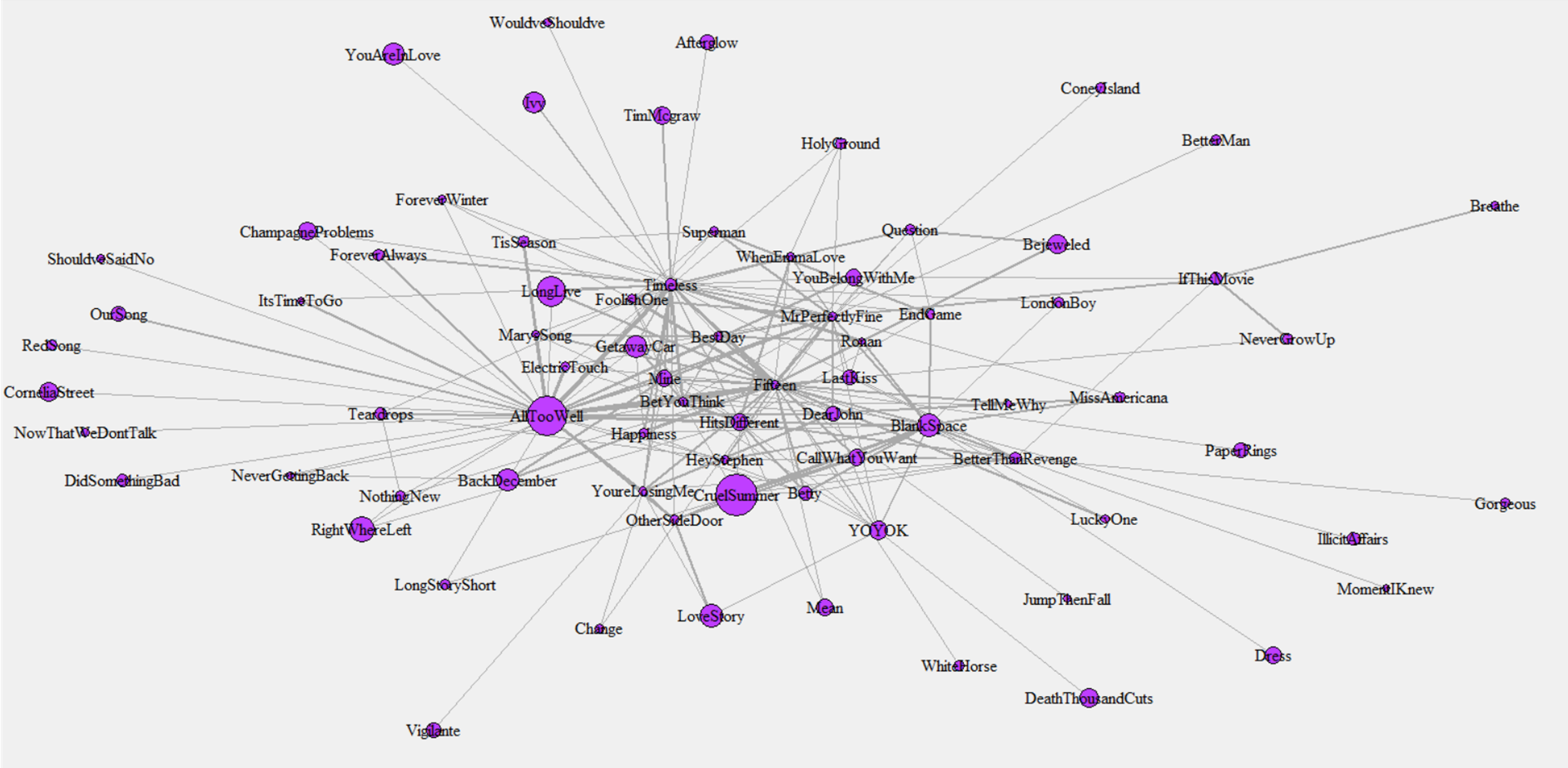
This is hard to visualize, in part because Taylor has so many songs. (And we Swifties are grateful for that!) Here’s a plot I used to demonstrate this to an audience recently, using a smaller selection of songs. Larger circles indicate more popular songs, with thicker lines meaning that the song shares more words in common. And, songs toward the center of the graph are more central, with those on the outside more peripheral. It seems that there is a knot of very popular songs at the center with lots of word overlap with other songs (“Cruel Summer,” “All Too Well,” “Long Live,” “Blank Space,” “Getaway Car”), while songs on the periphery are less popular.
Summary and Conclusion

So, then, yes: These results are consistent with the idea that the connection between Taylor’s songs is part of the appeal of her art. A caution, though, that we social scientists like to give: Just because two things are associated does not necessarily mean that one causes the other. Yes, it could be that audiences gravitate toward cohesive albums that connect to other parts of an artist’s work. Or, it could be that Taylor sees which songs audiences like, and makes those songs central by writing songs more like them.

My guess as to what’s going is, well, “both of these things can be true” (“Happiness”). Any artist’s popularity is crafted together with the fans who support them, something that Taylor has emphasized throughout her career. This again calls back to connections: It is the connections between the songs, as well as the artist and her fans, that animates her art and fuels its success.

In summary, my semantic network analysis found that:

  • We can map Taylor Swift songs based on their word overlap with other Swift songs.
  • The songs cluster into four core stories of (1) Villains and Heroes, (2) Longing and Regret, (3) Extraordinary Meaning in the Ordinary, and (4) Empowered Voice.
  • Taken all together, these four core stories form an overarching narrative of a woman moving from victim to voice, a journey of finding feminine meaning and worth in a masculine world that devalues such things.
  • Songs with high centrality (i.e., word overlap) tend to be more popular than songs with low centrality.
  • This is consistent with the claim that the discography forms a “Taylorverse” of interconnected meanings, and these connections are part of the appeal of her music.
The Four Types of Taylor Swift Songs (as Identified by Semantic Network and Fantasy Theme Analysis)

Many have claimed that Taylor Swift has built her own “Cinematic Universe,” and that this “Taylorverse” is part of the reason for her success. I decided to apply the tools of social science to find out whether, and how, that is the case.

Long story short: The data backs it up! If you want to see the full paper, it’s published here in Communication Quarterly. And if you can’t access it, or want a more accessible summary… keep reading. In this post, I’ll talk about how the analysis categorized Taylor Swift’s songs into four types, and how these types reveal the central meaning of the Taylorverse. In the next post, I talk about how the lyrical content of songs is associated with song popularity, as measured by stream count, expert rankings (but no, I didn’t include my own rankings in the analysis!), and social media mentions.

How are Taylor Swift’s songs connected?

Swifties have a habit of looking for connections among Taylor Swift’s songs, so much so that it is a meme. Sure, such fan theories are fun (if sometimes farfetched). And Taylor’s work seems to invite that kind of inspection, through repeated objects, scenes, and ideas: rain, cars, midnights, dancing, dresses, parties, heartbreak…

So, it seemed to me that, when taking a social scientific approach to the lyrics the Taylorverse, it was appropriate to focus on the words themselves. For example, several songs talk about doors: “The Way I Loved You,” “All Too Well,” “Everything Has Changed,” “Holy Ground,” “How You Get the Girl,” “Tolerate It,” and “Hits Different.” At least one word (“door”) connects these songs… but one word could be a random connection. How many words are needed before we can say that it seems like two songs have meaningful overlap in their vocabulary?

After feeding the lyrics for all songs on debut through Midnights (The Tortured Poets Department was announced while the work was already in progress and so isn’t included in the analysis), I got an answer to that question. It’s an answer I liked, and if you’re a Swiftie you’ll like it too. The number is… 13. If two Taylor Swift songs share at least 13 words in common, that’s above average and semantically meaningful overlap. Yes, that’s actually a mathematical answer based in the data… but I was also rather happy about it, for reasons beyond science. 😉

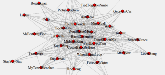
This approach allowed me to make a map of which songs connect to each other. Just one of the 200 songs from debut to Midnights wasn’t connected to any others, and that was “Epiphany.” That makes since, given the distinct subject matter of that song (World War 2; COVID). But, all of the other 199 songs are on the map, although there are so many connections that it is hard for a human being to see the patterns. Although the remainder of the post will focus on the albums through Midnights, I did calculate song centrality rankings for all songs through TTPD (click here).

A messy map of how Taylor Swift songs are connected to each other.

Four Types of Taylor Swift Songs

However, there are patterns in the connections that the computer can detect. Using a clustering algorithm, my analysis found that we can arrange these 199 songs into four groups. Here’s that grouping, with songs in italics in the periphery of the group (i.e., less central in the group overall), with those in italics more representative of the group overall. I’ve put the song groupings in chart form at the bottom of this post, organized by album. Even at a glance it is apparent that different albums seem to contain different song types (and stats supports that: album is significantly associated with song group).

Once these groups were identified, I used tools from rhetorical analysis to discern the meaning of these groups. Specifically, I used symbolic convergence theory, because it focuses on how large groups of people are held together by shared stories, symbols, and meanings. Think about any given night of The Eras Tour, as fans exchanged friendship bracelets, held their hands in the air like a heart, gave a long standing ovation for “Champagne Problems,” and dressed in outfits referring to specific songs and albums. Spotify’s image recognizing her as the 2023 top global artist depicts the deep, rich well of symbolic meanings that exist within the Taylorverse, meanings that outsiders find confusing but fans celebrate and enjoy.

Symbolic convergence theory refers to such shared meanings as fantasy themes, and helps discern those themes by calling attention to four elements of the story within each theme: (a) the characters, (b) the plot, (c) the setting, and (d) the “sanctioning agent,” which is a term for the authority that gives legitimacy to the vision. With this in mind, I considered each song group as representing a core story that that runs throughout the Taylorverse. In chronological order of emphasis, these core stories are: 

1. Stories of Villains and Heroes: These songs feature Taylor as the recipient of good or bad male behavior. Her boyfriends may be pure heroes, as in “Stay Beautiful” and “Hey Stephen”; more often they are clear villains, as in “Cold as You,” “Forever and Always,” and “Dear John.” The early hit “Love Story” is an example of both the heroic (boyfriend) and the villain male (the stubborn father), with Taylor the innocent victim. These songs are most frequent in the first three albums and become very rare from Reputation onward (although “You’re Losing Me” from Midnights is a modern example of the type). Following symbolic convergence theory, this story type emphasizes the characters in the unfolding drama.

Group 1 song map: Villains and Heroes

2. Stories of Longing and Regret: Moving into Speak Now and especially Red, Taylor’s identity and that of her boyfriends becomes more three-dimensional. She is no longer free of blame; she would “go back and time and change it, but [she] can’t” (“Back to December”), and she knew he was trouble when he walked in (“so shame on me”). Likewise the men are a more complex blend, as in “State of Grace,” where she accepts that the man she is with was “never a saint” and that she has “loved in shades of wrong.” These songs become less frequent after Red (but see “Getaway Car,” “Exile,” and “Anti-Hero”). Following symbolic convergence theory, this story type emphasizes the plot, usually of faded romance.

Group 2 song map: Longing and Regret

3. Stories of Finding the Extraordinary in the Ordinary: These songs are most scattered throughout the discography. Although they find their peak prominence in Folklore and especially Evermore, they appear early on too; indeed, her very first single “Tim McGraw” is an example of this song type. In these songs, rich sensory details serve as a window into deeper meanings in Taylor’s inner life. In “Tim McGraw” it’s the “old faded blue jeans” and the “moon like a spotlight on the lake”; in “All Too Well” it is that iconic red scarf; in “Champagne Problems,” it’s the “Midas touch on the Chevy door,” among many other details. Again, although these songs shine in the two indie albums, really it’s a foundational form of sensory storytelling throughout the Taylorverse. Following symbolic convergence theory, this story type emphasizes the setting and how it resonates with the emotional meaning of the story.

Group 3 song map: Finding the Extraordinary in the Ordinary

4. Stories of Empowered Voice: These are virtually absent in the early albums, until “Mean.” Doing this research project helped me see how important this song is in the discography. No longer is Taylor singing about romantic partners, but about a music critic; she’s addressing her career, and the challenges she faces within it as a woman. That song was a seed that grew a genre of story that is common from 1989 onward, characterized by sarcastic humor (“Blank Space,” “I Did Something Bad”), social commentary (“The Man,” “You Need to Calm Down”) and continued reflection on her own career (“The Last Great American Dynasty,” “You’re on Your Own, Kid,” “Mastermind,” “Long Story Short”). Following symbolic convergence theory, Taylor Swift is no longer a victim; she has become the sanctioning agent, or authority, that grants legitimacy to her (and her audience’s) perspectives and experiences.

Group 4 song map: Empowered Voice

Taylor Swift’s Rhetorical Vision: From Victim to Voice

The final step of a symbolic convergence theory analysis is to look for the overarching story that seems to unite the community. This is known as a rhetorical vision. In the published paper, I summarize the overarching story of the Taylorverse as this:

“The overarching rhetorical vision of the Swift discography, then, is a story of a woman transforming from heartbroken victim to empowered poet. She takes her audience through a journey of finding (feminine) worth, agency, and voice in a world of (often masculine) characters that try to deny her (and her audience) those things through abandonment, neglect, betrayal, or simple unwillingness to understand. The scene reinforces the vision, as setting her stories in commonplace (often domestic) locations builds a strong sense of identification between Swift and her audience (Morris, 2024), and the movement from rural to urban represents growing voice and confidence. The locus of the vision is not so much an external quest for influence, but rather an internal quest for self-value and understanding while ‘living in a world built for someone else’ (Heggeness, 2024).” (Ledbetter, 2024, pp. 20-21)

So, those are the four types of Taylor Swift songs identified in the analysis, and the overarching vision these four core stories create. Clearly, this overarching vision has artistic, cultural, and economic impact. But, not all Taylor Swift songs are equally popular; there seems to be a real difference in enthusiasm between “Blank Space” and “All Too Well” on one hand and, say, “Girl at Home” and “How You Get the Girl” on the same albums. (No disrespect intended if you like the latter two songs!… just looking at stream count…) In the next post, I consider the other major part of the paper, and that is how the semantic overlap between songs predicts a song’s popularity.

And, here is how the song types break down by album era:

AlbumGroup 1: Villains and HeroesGroup 2: Longing and RegretGroup 3: Extraordinary MeaningGroup 4: Empowered Voice
DebutCold as You
The Outside
Stay Beautiful
Should’ve Said No
Invisible
Picture to Burn
Teardrops… Guitar
Place in This World
Tied… With a Smile
Tim McGraw
Mary’s Song
Our Song
Only Me… With You
Perfectly Good Heart
FearlessLove Story
Hey Stephen
White Horse
Breathe
Tell Me Why
You’re Not Sorry
Forever & Always
Change
Jump Then Fall
Other Side… Door
Today… Fairytale
That’s When
Bye Bye Baby
Way I Loved You
SuperStar
You All Over Me
Mr. Perfectly Fine
Fearless
Fifteen
You Belong With Me
The Best Day
Untouchable
Come in… Rain
We Were Happy
Don’t You
NONE
Speak NowMine
Sparks Fly
Speak Now
Dear John
Story of Us
Better Than Revenge
Innocent
Haunted
Ours
If This Was a Movie
I Can See You
Back to December
Superman
Electric Touch
Foolish One
When Emma…
Enchanted
Last Kiss
Long Live
Castles Crumbling
Timeless
Mean
Never Grow Up
RedI Almost Do
Better Man Babe
State of Grace
Red
I Knew… Trouble
Never Getting Back…
Stay Stay Stay
Begin Again
Come Back… Be Here
Forever Winter
Treacherous
All Too Well
The Last Time
Sad Beautiful Tragic
Everything Has Changed
Starlight
The Moment I Knew
Ronan
Bet You Think…
Run
The Very First Night
22
Holy Ground
The Lucky One
Girl at Home
Nothing New
Message in a Bottle
1989All… Was Stay
I Wish You Would
How You Get the Girl
I Know Places
Clean
Slut!
Say Don’t Go Now… We Don’t Talk
NONEWelcome to NY
Out of the Woods
You Are in Love
Suburban Legends  
Blank Space
Style
Shake it Off
Bad Blood
Wildest Dreams
This Love
Wonderland
New Romantics
Is It Over Now?
Reputation… Ready For It?
Dress
Can’t… Nice Things
Call… You Want
Don’t Blame Me
So It Goes…
Getaway Car
Look What… Do
King of My Heart
Dancing… Tied
New Year’s Day
End Game
I Did Something Bad
Delicate
Gorgeous
LoverNONELover
The Archer
Afterglow
Forgot… You Existed
Paper Rings
London Boy
Soon… Get Better
Nice to Have a Friend    
Cruel Summer
The Man
I Think He Knows
Miss Americana…
Cornelia Street
Death… 1000 Cuts
False God
Need to Calm Down
ME!
Daylight
FolkloreThis is Me Trying
Mad Woman  
Exile
My Tears Ricochet
Mirrorball
August
Peace
The Lakes
Cardigan
Illicit Affairs
Invisible String
Hoax
The One
Great American Dynasty
Seven
Betty
EvermoreDorotheaNONEChampagne Problems
Gold Rush
‘Tis the Damn Season
Tolerate It
Coney Island
Cowboy Like Me
Marjorie
It’s Time to Go
Willow
No Body, No Crime
Happiness
Ivy
Long Story Short
Closure
Evermore
Right Where…
MidnightsLavender Haze
Vigilante Shit
Sweet Nothing
The Great War
Glitch
You’re Losing Me
Anti-Hero
Midnight Rain
Labyrinth
Maroon
Bejeweled
Karma
Bigger… Whole Sky
Paris
Would’ve… Could’ve
Snow on the Beach
You’re on Your Own, Kid
Question…?
Mastermind
High Infidelity
Dear Reader
Hits Different

Nebraska Furniture Mart Bathroom Remodel Review: A Warning

Normally I review Taylor Swift’s songs and albums, which is really fun, but here I’m reviewing something much less fun: Our bathroom remodel with Nebraska Furniture Mart (NFM).

We have been NFM customers for almost 20 years, furnishing our first apartment as a newly-married couple out of the Omaha store, and much of our Texas home from the location at The Colony. Among the options available, we chose NFM for the renovation due to this longstanding customer relationship and their brand reputation.

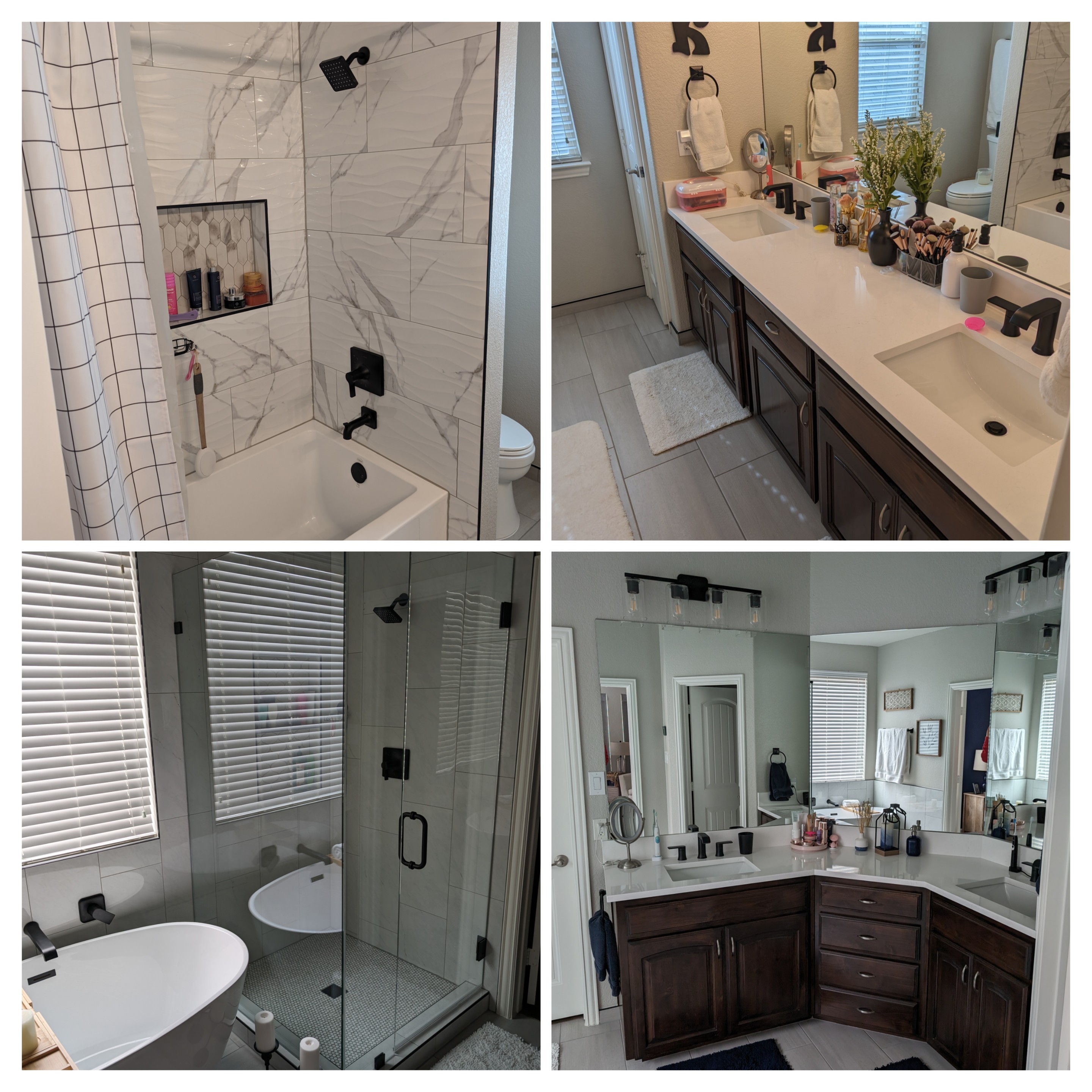
Here’s some videos and pictures from the 5-6 week project that turned into a 6+ month renovation nightmare that still isn’t settled.

The waterfall flood

The first time we tried to use the upstairs shower, we discovered that NFM had actually installed this new ‘water feature’ in our master bedroom. They paid for a third party inspector, who discovered that NFM’s incompetent subcontractor, who was probably unlicensed, caused it due to misinstallation. More on the quality of their work in a moment.

We’ve asked for licensing information about the plumbers who did the work, and NFM has refused to provide it. One NFM employee did, however, cite their longstanding relationship with this subcontractor in an email to us (“Since we use the subcontractor for many different projects, we do not have access to what staff have been requested for each home”).

We’ve also asked to see the inspection report, and NFM won’t give us that either.

Here’s more detail on the incompetence that caused the flood. (I wish I’d caught on camera how the fixtures moved up and down, but that was a crazy week…)

The destroyed master bed

But it is apparent that the subcontractors should have known about the misinstallation. Because we were replacing our master ceiling fan at the time, our master bedroom mattress was right below the vent at the time the workers installed the shower. That earlier flood destroyed the mattress and the bed.

Valve leak and the bathroom cabinet

NFM incorrectly installed the shutoff valve in an upstairs bathroom sink. It leaked every 8 seconds for a week and damaged the bottom of the cabinet.

Missing caulk around standing tub

I mean, water can only splash out of the tub in the front, right? WordPress isn’t letting me embed the tweet with the video of the poor caulking, but here it is: https://twitter.com/dr_ledbetter/status/1758919452475768842

But, the bathtub didn’t hold water anyway…

No O-ring means no seal, which would mean a rather short bath.

Trashy, smelly garage

NFM said the worker’s trash wouldn’t be stored on site. Yet our garage was filled with trash for weeks. What this picture can’t capture is the rancid stench from the workers’ leftover food as it decayed in the sweltering Texas summer heat.

Questionable quality

Here’s the niche in the upstairs shower. The workers made it rather small. Notice the messy grout around the edges, and the way the gray grout bleeds into the white grout. And the tiny triangles at the top are a strange way to cut the tile. This is but one example of many quality issues during the initial install.

Firing the subcontractor and discovering even more problems

After 8 weeks of dealing with these quality issues, culminating in the flood, we were livid. We insisted, and NFM fired their incompetent subcontractor they use “for many different projects” and hired someone who was actually competent to do the work. And that contractor discovered many, many problems with the first contractor’s work. So, after moving out of the house for 8 weeks to avoid living through a renovation… well, we lived through a months-long renovation anyway.

Lack of upstairs tub support

The waterfall flooding wasn’t the only issue with the upstairs tub/shower. NFM didn’t bother to put support underneath, per installation instructions. Instead, it was sitting on leveling feet, and those feet weren’t even level. For about three months this was our only working shower (once the flooding issue was repaired, of course). Not real fun as a family of four, and the tub bottom felt squishy and unstable while using it. Our entire family continually felt like we might fall through the floor of the tub at any moment while showering.

Wrong lumber in the master shower

I’m no expert on these things (and it appears NFM might not be, either), but apparently you’re supposed to use pressure-treated lumber for a shower, given the dampness of the area. NFM used plain old lumber. I’m told NFM used the wrong type of concrete as well. This meant that the shower floor had to be completely ripped out, all the way back down to the foundation to redo it properly and then have it permitted and inspected, which the original NFM contractor never did.

Uneven backsplash

Of course the bathroom mirror glass couldn’t be installed until this was done. It took the countertop folks about four trips to the house and weeks of delay to finally get it right.

No insulation for a pipe on an external wall

Our new standing tub needed pipes to run along an exterior wall for the placement of the fixture. Even though I’m no expert, I know insulation is needed so that pipes don’t freeze. But NFM didn’t put any in there. And to have the new pipes on this exterior wall required cutting through some studs that hold up the roof of the house. You guessed it, improper support was provided where the studs were notched.

Improperly installed tile

This video also shows the bags of tile debris, which definitely does not contain insulation (see above).

Wrong color grout for the master shower floor

If white grout around white tile is your thing, hey, you do you. But to us, it looks washed out and bleh. Before work began, we made it clear that we wanted gray grout around the white tile. NFM didn’t communicate this to the original subcontractors. Even though the subcontractor called me to clarify, they still misinstalled it, so they did it again. Then the new contractor had to rip it all out… but NFM miscommunicated again, and we had white on white a second time (!). They finally got it right the fourth time.

Not getting proper permits and inspections for plumbing work

Even with reliance on a subcontractor, I don’t know how this procedural and legal detail escaped NFM’s attention. And the shower drain was loose, so water could have traveled along the drain pipe down into the foundation of the house.

What about the aftermath?

I wish I could say that, in the aftermath of all of this, NFM has engaged in good customer service, treating us like longtime customers who spent a lot of money in their store on this project. That has only been the case regarding actually fixing the work. In the end, the bathrooms turned out fine.

Disappointing customer service

Making things right has been another story. We spent thousands of dollars to cope with the flood in August (hotel fees, replacing the master bed, etc.). NFM wasn’t interested in reimbursing that money until the work was done… in January.

And by that point, they were uninterested in talking directly to us at all. They just wanted to push us off onto their insurance claims adjuster (who, obviously, works to serve NFM, not help us). Nearly a month ago, I asked for a high-level member of their customer service team to call us to discuss what happened and how to make it right. Other than a few curt and uninformative emails from the store manager at The Colony, we’ve heard nothing. At one point, we called and left a voicemail. NFM never returned the call.

But when I tweeted about the flood, they did tweet back. “Just talk with us through the BBB” is painful to hear after our experience.

Confusing financial practices

Dealing with NFM’s financial practices also has been frustrating and confusing. We took some credit from NFM to fund the project. By the time the initial subcontractor was fired in late summer, NFM said we owed a certain amount, and that amount was consistent with our agreement when we contracted for the work.

Then in September, the amount dropped by a few hundred dollars.

In October, our bill was over $1000 less than the prior month.

Then in November, $6500 less!

But in December, it was $6300 more.

And in January, another $1200 more.

We’ve asked for explanation why our bill has gone up and down. They’ve pointed to their general accounting practices–essentially, ‘this is just how we do business.’ They also sent us this spreadsheet, which isn’t exactly illuminating. It feels like NFM is making this up as they go.

Personal impact

But beyond the construction hassles, the financial wonkiness, and the poor customer service, this has just plain overshadowed so much of our lives since last June. We moved out of our house unnecessarily over the summer, during which our youngest daughter slept on an air mattress for 8 weeks.

My wife and I both work in higher education, and we planned the renovation for the summer because that is a slower and more flexible time. During fall semester and now spring, this has impacted our work productivity, between meeting with contractors and phone calls and emails.

Our house wasn’t a great place to celebrate the holidays, when the work should have been long done. It has been massive amounts of stress and time lost that we’ll never get back.

And the impact on our kids is just the worst. Here’s my oldest daughter’s narration the night of the flood, as we packed up to head to a hotel. (Admittedly, the lost wallet is my fault, not NFM’s, though the stress of this entire ordeal certainly didn’t help matters!)

We regret choosing Nebraska Furniture Mart for the renovation, and we will not buy so much as a lightbulb there in the future. We hope our story helps others make informed decisions about home remodeling work.

The Eras Tour’s Eras, Ranked by a 40-Something Bald Professor

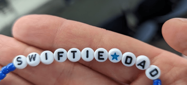
Friendship bracelet that says "Swiftie Dad" in its beads.
Thanks to the Swiftie mom and her Swiftie daughter who gifted me this friendship bracelet soon after I entered the stadium!

My voice is hoarse, my caffeinated drink is at my side as I head into a long day of teaching… but it was all totally worth it! The Eras Tour is an amazing show and a delightful celebration of Taylor’s broad and deep discography!

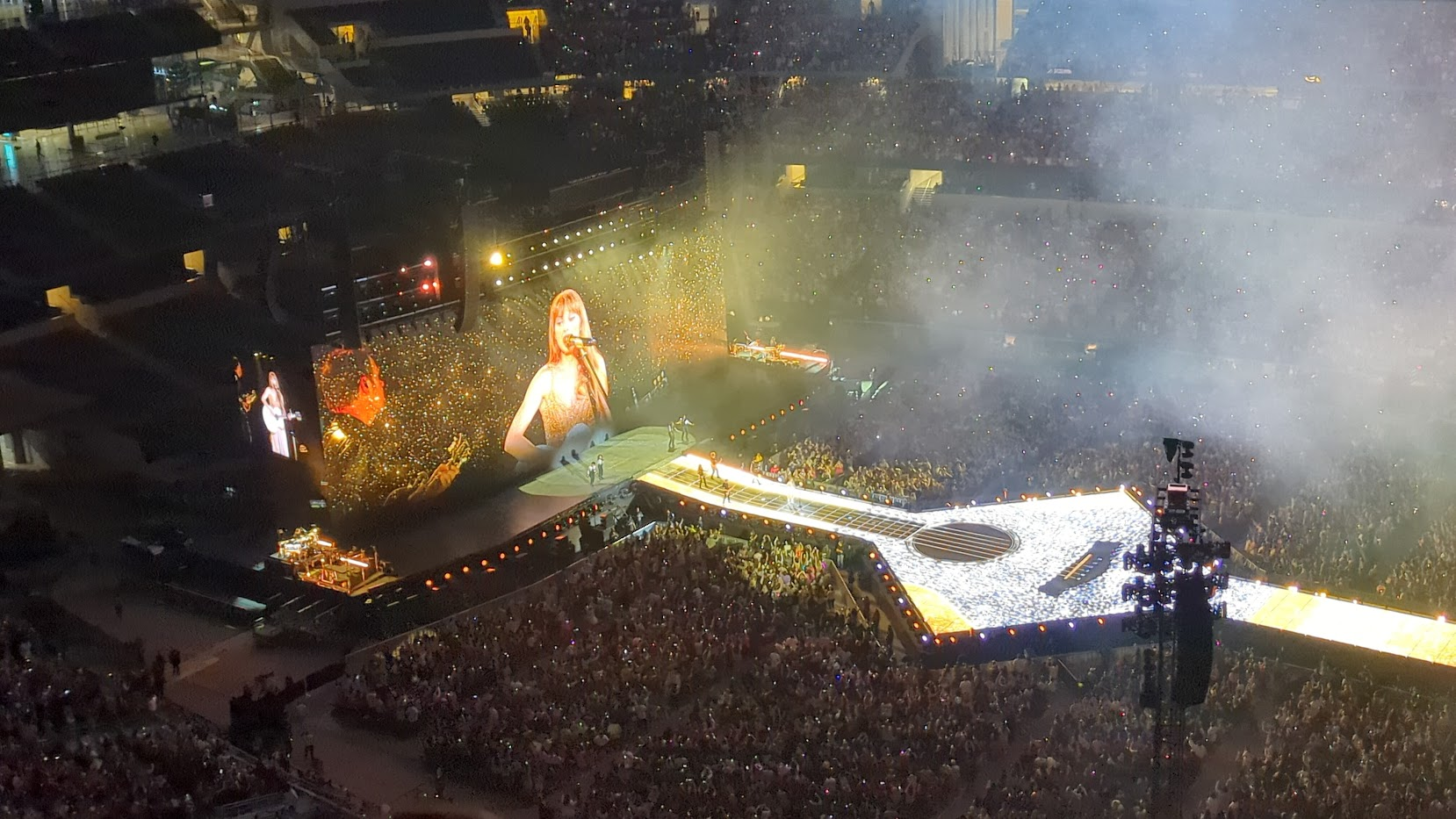
Because I’m a quantitative social scientist, I can’t help but rank things as a way to enjoy and appreciate them… so here I’m going to rank the presentation of each era at the Eras Tour concert I attended (Sunday, April 2, AT&T Stadium in Arlington, TX). Bottom line: They’re all great. The show is maybe the biggest music event I’ll ever see–a concert/sing-a-long/costume party with tens of thousands of your fellow Swifties. So this ranking is in the spirit of having fun and celebrating that Swiftie experience.

And, of course, it reflects my own enjoyment. Please feel free to disagree, and I’d love to hear your thoughts in the comments! If you want to see my other Taylor rankings, check out my ranking of Taylor Swift’s songs and her albums. And if you want to hear more of my thoughts about the concert, I had the opportunity to speak with Sarah Asch about it in a Texas Standard radio spot before the show, and then a chance to debrief it with her and Wells Dunbar after the show on Twitter Spaces.

So here’s the ranking… obviously, spoilers follow. Except for one from my wife, images are my own taken on a cell phone at the 400 level.

10. Taylor Swift (debut album). This is at the bottom because… well, it was absent. I think that choice is defensible; even in a 44-song set, she can’t cover everything (because she’s produced that much music across such a long period of time).

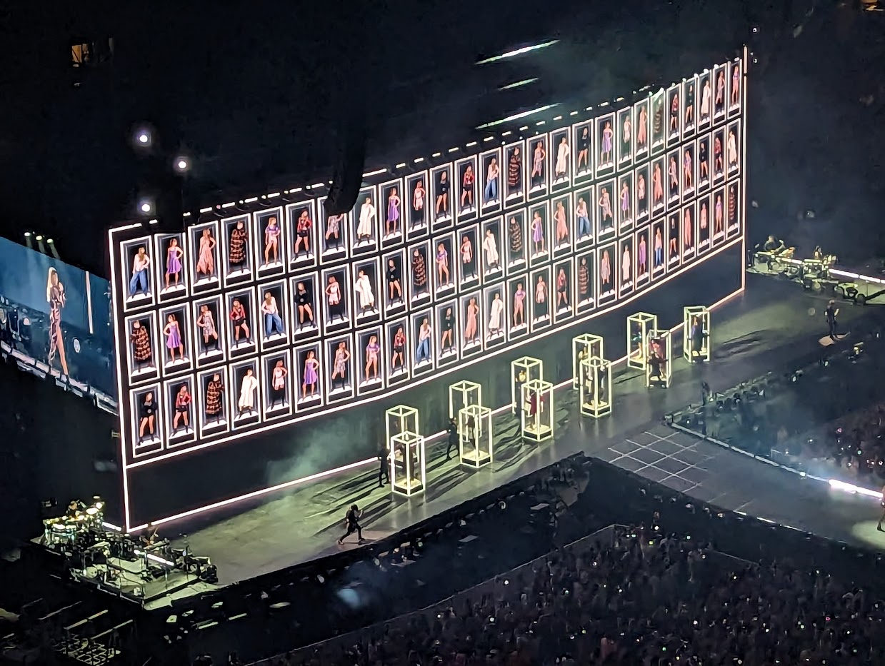
Image from "Look What You Made Me Do," The Eras Tour

9. Reputation. This being ranked low may have much to do with my high expectations. Reputation is one of my absolute most favorite Taylor Swift albums, one that I initially viewed with skepticism but have come to really appreciate and enjoy. The snake imagery on stage was great (including a snake microphone!), and I especially enjoyed how that transitioned into the Speak Now era, with the big snake slithering across the runway. What left me wanting, then? There was no “Getaway Car.” That song is just at the crux of this era and I felt its absence; I would’ve traded any of the four she chose for that one. Also, the back half of the album’s resolution from the first half’s angst was absent too; that’s more understandable, because again, she can’t cover everything. But, my two cents: “Getaway Car” should’ve made the cut. I hope it shows up in later concerts. The people in glass boxes during “Look What You Made Me Do” was delightfully weird, though.

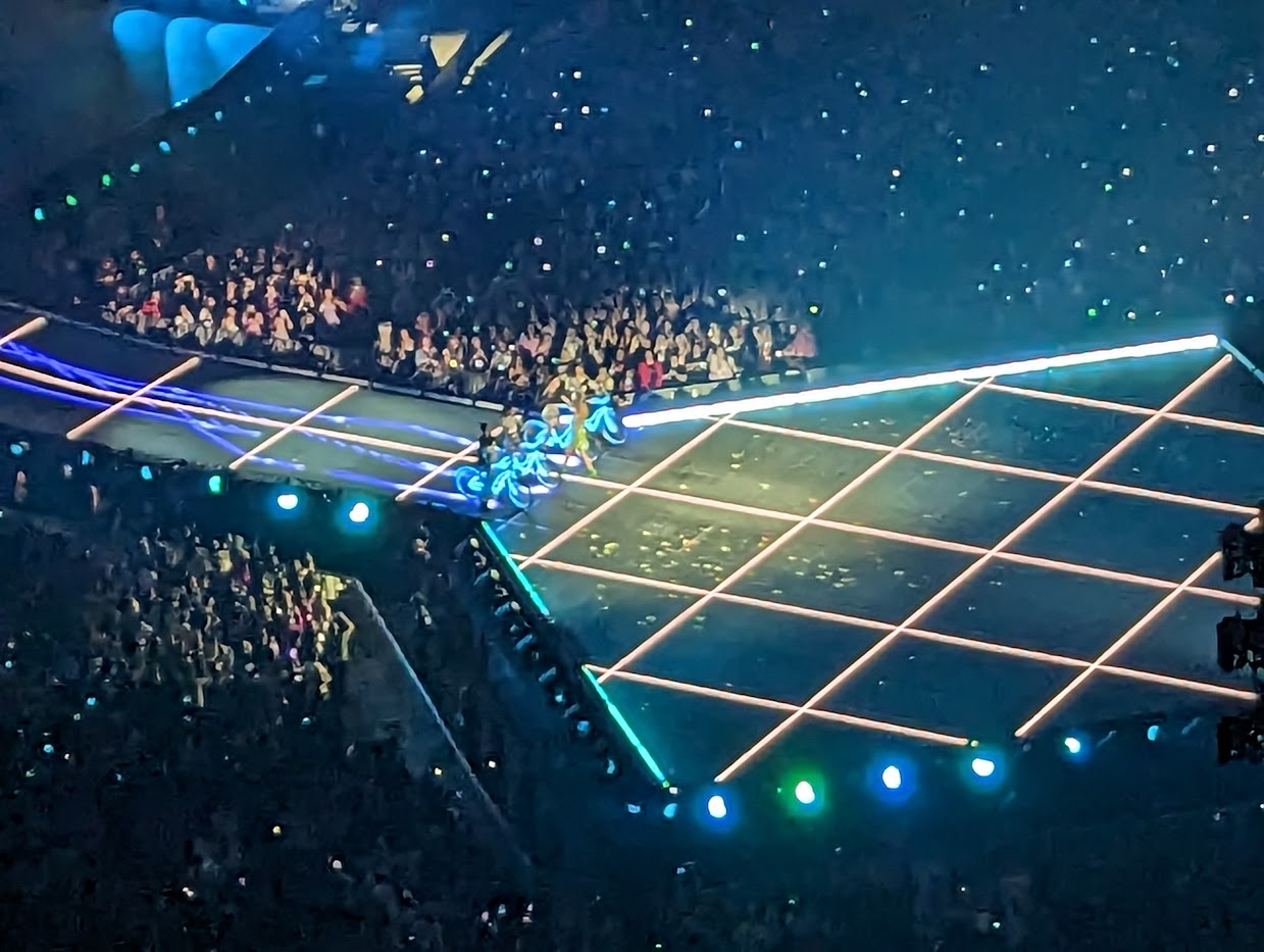
Image from "Blank Space," The Eras Tour

8. 1989. I’m not sure “Shake It Off” has aged that well. As I’ve written in my ranking of her songs, it’s the one TSwift song that, to my ear, is a bit “been there, done that.” But, although “Blank Space” has never hit me as much as it hits others, it came alive in the stadium environment, and the Tron-style grid lines and neon bikes (with golf clubs? Wow!) was pretty cool. So were the pyrotechnics in “Bad Blood,” another song that isn’t my favorite but worked well here.

Image from "Enchanted," The Eras Tour

7. Speak Now. Only reason this is a bit low is because we only got one song, “Enchanted.” But that was a stellar choice. Taylor’s performance of this jewel of a song was passionate and warm and epic, and a highlight of the entire show. I look forward to seeing this era get more time in the sun soon (we hope) with Speak Now (Taylor’s Version).

Image from "Willow," The Eras Tour

6. Evermore. This is not my favorite Taylor Swift album, but her performance of this era was great. The way she played “Champagne Problems” shows that she knows her audience (“you ready for the bridge?”), and the stagecraft of “Tolerate It” was outstanding (excellent acting work not just by Taylor, but by the dancer who played the dismissive husband). I just wish the jumbotron had shown the on-stage action for “Tolerate It” like every other song; I don’t know if that was a deliberate artistic choice or a technical glitch specific to our show. The picture above is of the fire effects for “Willow,” and you can see the trees that emerge from the stage in the upper left.

Image from "Mastermind," The Eras Tour

5. Midnights. The transition to Midnights is incredible, with Taylor diving into the stage after her acoustic set, appearing to swim beneath the stage, enter the cloud, and emerge in Midnights garb. And I’m glad “Midnight Rain” made the setlist–it was a reflective complement to the more energetic songs. I confess that I find myself wondering: Did the dancers wearing different colors in the final number (“Karma”) symbolize different eras, maybe even eras left to come? If so, perhaps a dark green, a white, and a gold album are in our future? She is a “Mastermind,” after all (and I’m glad that also made the cut, and I liked the chessboard theming of that one).

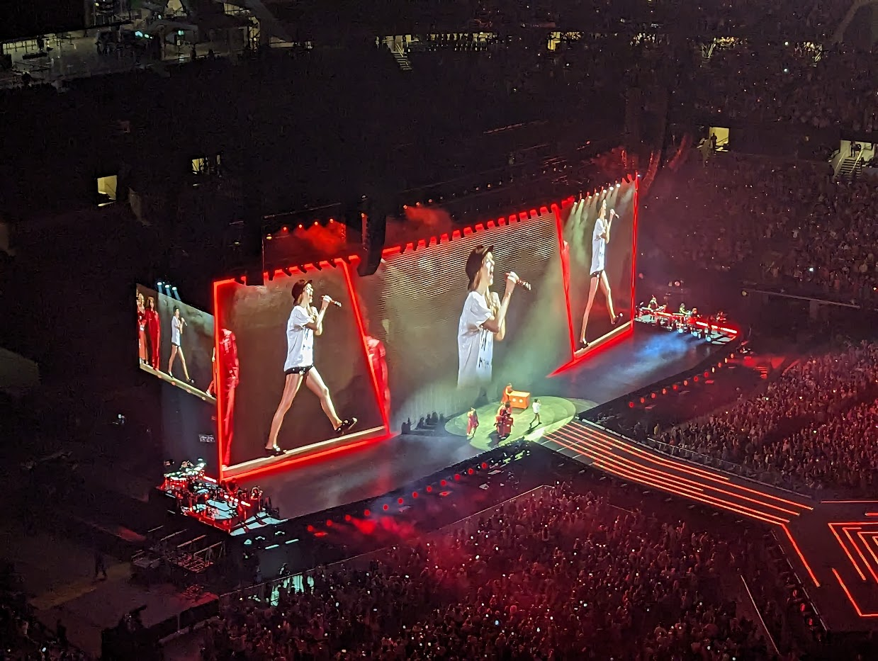
Image from "22," The Eras Tour

4. Red. My only complaint about the treatment of Red is that it was impossible to do the album, which is now an expansive masterwork in its Taylor’s Version version, full justice. That’s where the 10-minute “All Too Well” is both a benefit and a drawback: A benefit as a true showstopper, where much of the production drops out and its just Taylor connecting with the audience, but a drawback because it means other great songs from Red just can’t make the show. But as someone who is almost 44, I’m glad that at the age of 33, she’s still singing “22.”

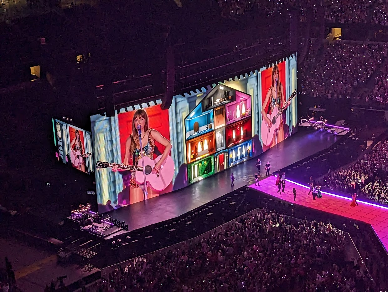
Image from the Lover era, The Eras Tour

3. Lover. Such a strong start to the show and great to see this underrated album finally, finally get some serious attention four years after its release. My eyes got moist when the “Miss Americana” intro came on, and I wish that song had been allowed to bloom into its powerful self, but moving right into “Cruel Summer” was also a solid choice. The pageantry of “The Man” was outstanding, and I especially enjoyed how the flaming arrows of “The Archer” transitioned from a burning Lover House into…

Image from the Fearless era, The Eras Tour

2. Fearless. I didn’t expect this era to hit me this way! But shouting these classic lyrics while jumping (yes, I’m a 43-year-old man and I was jumping!) with 80,000 other Swifties is just peak Eras Tour. “Fearless,” “You Belong With Me,” and “Love Story” seem custom-made to have big impact in an arena, and here, 15 years after the release of that album, it felt like they hadn’t aged a day.

Image from the Folklore era, The Eras Tour (taken by Jessica Ledbetter)

Image from "August," The Eras Tour

1. Folklore. Despite the brisk pace of the 3-hour show, Taylor effectively captured the mood and tone of each album era (except debut, of course), but of any era, this was the one that felt like it had the most chance to breathe. The woodsy staging with the cottage was great, the phalanx of mourners and water-styled fire of “My Tears Ricochet,” the rich colors and sheer fun of “August,” the band performing on the cottage steps for “Betty,” the elegant dress of the dancers in “Last Great American Dynasty”… yeah, she made the right decision to let her most recent Grammy-winning album shine, and that these intimate songs work in a football stadium is testament to her stage presence and her artistic genius.

Finally, let me give a shout-out to the staff of AT&T Stadium, who let us in early when a thunderstorm and potentially severe weather hit before they were set to open! Thanks for keeping us safe!

A closer look at TCU’s drop in the 2022-23 US News & World Report rankings

The release of the 2022-23 US News & World Report (USNWR) rankings contains good news for TCU: As the university press release proclaims, TCU is in the top 100 nationally-ranked universities for the 13th year in a row. That is no small achievement and all Horned Frogs should celebrate it!

What the university press release didn’t mention is that TCU dropped from #83 last year to #89 this year. Of course, rankings don’t tell the whole story, and the US News & World Report rankings have been the focus of recent controversy. At the same time, the rankings have long been the benchmark for universities, and for my part, I rather like that they are based on a wide range of factors (if you want to dive into that, see the USNWR methodology page and their explanation of criteria and weights). Although the USNWR rankings aren’t the final word, they nevertheless convey something informative about the quality of the schools on the list.

So what about TCU’s 6-point drop? This year, several schools are tied at TCU’s former (2021-22) spot of #83: Binghamton University–SUNY, Gonzaga, Marquette, Stevens Institute of Technology, University of California–Santa Cruz, and University of Iowa. And likewise several schools are tied at TCU’s new spot of #89, including incoming Big 12 opponent BYU, as well as Colorado School of Mines, Elon, Howard, University at Buffalo–SUNY, University of California–Riverside, and University of Delaware.

That’s not bad company; these are solid, respectable schools. But is it the company that TCU seeks? A few years back, TCU’s Chancellor’s Cabinet self-identified ten peer schools. Here are those school’s rankings:

  • Wake Forest (#29)
  • Tulane (#44)
  • Villanova (#51)
  • Pepperdine (#55)
  • Santa Clara (#55)
  • George Washington (#62)
  • Syracuse (#62)
  • American (#72)
  • SMU (#72)
  • Baylor (#79)

At #89, I’m not sure most of these universities would name TCU as a peer. Indeed it seems that TCU’s peers have become its aspirants.

Going by the rankings, the ten private universities closest to TCU are Baylor (#77), Loyola Marymount (#77), Gonzaga (#83), Marquette (#83), Stevens Institute of Technology (#83), BYU (#89), Elon (#89), Howard (#89), Clark (#97), and University of San Diego (#97). With the exception of Baylor, which is a newly-minted Research 1 university positioned to ascend higher in future years, the USNWR list looks much different than TCU’s self-defined list.

What could lead to an increase in TCU’s ranking? That’s a question with many possible answers, including reduced class sizes (notably, the Board recently increased TCU’s student/faculty ratio from 13:1 to 14:1, amid budget cuts across the university’s academic units), increased alumni giving, greater graduation and retention rates (one of TCU’s strengths is that these are already high), and the beguiling standard of “undergraduate academic reputation” (which is essentially a popularity contest among senior administrators and admissions officers nationwide and, in my opinion, accounts for too much of the USNWR score).

One action worth considering is increased faculty compensation, which has accounted for 7% of the ranking in recent editions of the survey (equivalent to student selectivity of the entering class). USNWR uses this as a benchmark because, they say, “Research shows there is a link between academic outcomes and compensation of faculty.” Analysis from TCU’s Faculty Senate in 2019 and 2020 found that TCU’s compensation lags behind that of other nationally-ranked private universities, and a 2022 analysis suggests TCU’s compensation has gotten worse after rising inflation.

On the University Compensation Advisory Committee (UCAC), we have been discussing TCU’s compensation targets, which are 90% of the AAUP doctoral university median for faculty, and 80% of the median for staff. By definition, salaries below the median are below-average salaries, which seems inconsistent with TCU’s identity as a top-100 nationally-ranked university whose top strategic priority is to raise the academic profile.

Also inconsistent with that identity is TCU’s move to diminish the importance of faculty research. TCU has long been committed to the teacher-scholar model, which recognizes the equal worth of both teaching and research. As the TCU Faculty Senate put it in 2019, “Teaching and scholarly activity (such as research and creative activity) are mutually compatible and reciprocal, and exceptional performance in one inspires equal merit in the other.” But now, TCU’s Provost’s Office is far along in a plan to recalibrate tenured/tenure-track faculty workload for many units, such that 50% of faculty effort would be devoted to teaching and only 30% to research. This places faculty research closer to service work (20%) than teaching. If TCU wants to improve its scholarly reputation, drive innovation, and discover solutions to the challenges facing our world, this is not the way to go.

In the end, then, the 6-point drop should provoke discussion and raise at least a bit of concern, but given the number of schools tied around our current (#89) and former (#83) rank, it should not be a matter of overreaction either. Much more concerning are the institutional decisions that could inhibit increases in the rankings and, more importantly, the academic quality and success of the university in the future. For example, TCU remains vulnerable to the next inevitable phase of athletic conference realignment, as the power conferences have a demonstrated preference for Research 1 universities.

The time is ripe for TCU to increase investment in the core academic mission of the university: The faculty, academic and student support staff, research labs, undergraduate and graduate programs, library resources, and grant development, along with a vigorous public relations campaign that emphasizes TCU’s commitment to scholarship. Beyond the USNWR rankings, these will enhance the ability of TCU’s students, faculty, and staff to make a positive impact on our world.

Comm Theory Pop Culture Connections (Taylor’s Version)

I’m a communication professor who co-authors a communication theory textbook and a website full of pop culture connections to comm theory. I’m also a Swiftie who has ranked every one of Taylor Swift’s songs. I figured, why not combine those things together?

And so it goes… this is me trying to use communication theory as an invisible string that runs throughout the Swiftverse.

Specifically, here’s a list that provides one connection between Taylor Swift and each of the 33 theories in A First Look at Communication Theory (11th edition). Of course there are more theories than this in the communication world… and of course there are many more possible connections to Taylor’s music. If you have a good example, feel free to leave it in a comment below.
Interpersonal Communication Theories

  • Symbolic interactionism (Mead): “Begin Again,” Red. This song begins with Taylor Swift looking in the mirror, but not just the physical mirror in front of her—she’s gazing at her looking-glass self, remembering how her ex criticized her.
  • Expectancy violations theory (Burgoon): “Betty,” Folklore. Betty’s ex-boyfriend James wonders what will happen if he appears unannounced at Betty’s party. Will she receive him warmly or reject him? Based on EVT’s twin concepts of violation valence and communicator reward valence, what would the theory predict?
  • Family communication patterns theory (Koerner & Fitzpatrick): “The Best Day,” Fearless. In this ode to her family, and specifically her mother, Taylor celebrates her ability to talk openly with them. Note particularly the second verse where her mother serves as a source of emotional support, as well as how throughout the song the open talk translates into communication that builds children up. It’s an effective picture of positive outcomes arising from conversation orientation.
  • Social penetration theory (Altman & Taylor): “Delicate,” Reputation. In the chorus of this song, Taylor wonders aloud if she has shared too much, too soon. Social penetration theory would suggest that she’s wondering whether the knife has cut too deeply into the onion.
  • Uncertainty reduction theory (Berger): “Paper Rings,” Lover. Immediately after meeting her boyfriend (presumably, Joe Alwyn), she looks him up online… the extractive uncertainty reduction theory. Why, according to the theory, might she be particularly motivated to reduce uncertainty in this situation (including, apparently, reading all of his books)?
  • Social information processing theory (Walther): The infamous 27-second phone call when Joe Jonas broke up with Taylor, The Ellen Show. She seems hurt as she shares about this with Ellen DeGeneres. The theory might suggest that’s because the cue-limited medium didn’t enable the then-teenagers to clarify what happened, especially during such a short call.
  • Relational dialectics theory (Baxter & Bakhtin): “Our Song,” Taylor Swift. Here, Taylor expresses frustration to her boyfriend that they don’t have a song for their relationship. RDT scholars might say that she wants to find an already-spoken cultural discourse that shapes their bond. In the end, Taylor creates her own; but, according to RDT, is it really a new discourse, or just echoing relational discourses in country music that have come before?
  • Communication privacy management theory (Petronio): “All Too Well,” Red. In the bridge of this epic song, Taylor reports that her (ex-)boyfriend’s sharing of private information had devastating consequences on her well-being. As Petronio contends, self-disclosure does not necessarily lead to intimacy.
  • Media multiplexity theory (Haythornthwaite): “Girl at Home,” Red. When flirtation verges on infidelity, what’s Taylor’s advice to the guy hitting on her? Delete her telephone number. According to the theory, that’s a good way to reduce the strength of their tie.

Persuasion Theories

  • Social judgment theory (Sherif & Sherif): Kanye West’s shocking choice to grab the microphone from Taylor at the 2009 VMAs. Clearly, Beyoncé fell in Kanye’s latitude of acceptance for the award, and Taylor fell in his latitude of rejection—which is right where Kanye’s rude behavior landed for most viewers.
  • Elaboration likelihood model (Petty & Cacioppo): “Enchanted,” Speak Now. This song finds Taylor full of insomnia, awake in the middle of the night thinking deeply about the man that she just met. She is clearly motivated to process the relationship centrally, so much so that her need for cognition exceeds her need for sleep.
  • Cognitive dissonance theory (Festinger): “Sparks Fly,” Speak Now. As Taylor notices her new romantic interest, she knows dating him isn’t a good decision, but she chooses to ignore this fact.
  • The Rhetoric (Aristotle): Taylor Swift’s commencement address to NYU’s Class of 2022. According to Aristotle, what kind of speech is this: deliberative, epideictic, or forensic? How does she establish her ethos? Do you see any other modes of proof in the speech?
  • Dramatism (Burke): “Mean,” Speak Now. Taylor wrote this song in response to a music critic who criticized her, and Taylor’s response is Burkean victimage. If you apply the pentad to this song, which elements does Taylor emphasize?
  • Narrative Paradigm (Fisher): “The Story of Us,” Speak Now. Taylor Swift’s music often uses the metaphor of story to describe love—but according to Fisher, perhaps story is more than a metaphor. In this song, Swift seems to use narrative rationality to evaluate her romantic relationship. Because the story of their love (and specifically, the story of her boyfriend’s behavior) lacks both narrative fidelity and coherence, she is dissatisfied. If you want to take this idea farther with Swift’s music, you might examine “Love Story” (Fearless), where she likens a romance beset by family drama to Shakespeare’s Romeo and Juliet.

Group and Organizational Communication Theories

  • Functional perspective on group decision making (Hirokawa & Gouran): “You Belong With Me,” Fearless. Did you realize this hit song is about decision making? The girl in the song has analyzed the problem: her male friend is in an unsatisfying romantic relationship. And she’s identified two alternatives: he can stay with his current girlfriend, or ditch her for a relationship with the singing girl. As for goal setting, the singer lists several criteria, from music tastes to dress to sense of humor. If only he’d follow the four functions, she thinks he’d realize his best and most reasonable choice.
  • Symbolic convergence theory (Bormann): “Miss Americana & The Heartbreak Prince”, Lover. Taylor Swift wrote this song as an allegory about the election and presidency of Donald Trump, using the imagery of a high school football game to imagine American politics in a creative and memorable way.
  • Cultural approach to organizations (Geertz and Pacanowksy): “Epiphany,” Folklore. Taylor imagines what life was like for her grandfather in the military during World War II, and for doctors during the COVID pandemic. For both groups, the emotion conveyed in the song rests in the tension between the corporate (leadership) and collegial (“how things really work”) narratives in those organizations.
  • Communicative constitution of organizations (McPhee): Folklore: The Long Pond Studio Sessions (19:14-22:10). CCO addresses how organization is constituted through communication, a process that occurs when closure is achieved through back-and-forth interaction. This entire show focuses on how this was accomplished by Taylor and her collaborators, creating a Grammy-award winning album during the isolation of the COVID-19 pandemic. This clip focuses on the song “Exile,” addressing how the song grew from a piano riff by Taylor’s boyfriend Joe Alwyn, to collaboration with Aaron Dessner, to including Justin Vernon (Bon Iver). Which of the four flows occur in this very organic example of organizing? If you watch the entire show, do you see all four flows present in the creation of the Folklore album?
  • Critical theory of communication in organizations (Deetz): “My Tears Ricochet,” Folklore. This song might sound like it is describing the funeral of an ex-lover, but the deeper layer of meaning is this: Taylor is critiquing music industry practices that favor management and disempower artists. She’s particularly concerned about practices like the contract she signed as a young artist, a contract that seems to be in her favor but wasn’t. Deetz might label that “consent,” and instead, Taylor seems to want something more akin to stakeholder democracy (participation).

Cultural Context Theories

  • Communication accommodation theory (Giles): “I Bet You Think About Me,” Red (Taylor’s Version). Taylor draws a stark contrast between her own socioeconomic background and that of her ex-boyfriend. His constant divergence is a key cause of their breakup.
  • Face-negotiation theory (Ting-Toomey): “Tolerate It,” Evermore. See how the distressed wife’s conflict strategies and face-concern change over the course of the song, moving from other-face toward her husband at the beginning, then to self-face by the end.
  • Co-cultural theory (Orbe): “You Need to Calm Down,” Lover. Orbe’s research has investigated the LGBTQ community, an audience Taylor addresses in this song. How would dominant group theory describe the lyrics of the second verse?
  • Afrocentricity (Asante): “What Wildest Dreams Gets Wrong About Africa,” MTV News. Taylor’s video for “Wildest Dreams” takes place in Africa. This clip critiques that choice because, for example, it portrays Africa as a single country and culture rather than a multitude of countries and cultures.
  • Feminist standpoint theory (Harding & Wood): “Mad Woman,” Folklore. The thesis of this song resonates deeply with feminist standpoint theory: Women (and others on the margins of society) have insights into society that members of more powerful groups don’t possess.
  • Muted group theory (Kramarae): “The Man,” Lover. Here, Taylor considers what her life would be life if she were a man—how would she be perceived? What power and influence would she have? This reflection reveals the bias and muting enacted against her within the music industry because she is a woman.

Media Theories

  • Media ecology (McLuhan): “Coney Island,” Evermore. There’s one line in this song that reflects on how the Internet has changed shopping in America, and with it people’s social lives… and beyond the lyrics, something about the wistful reflective mood of this song fits with media ecology’s concern that perhaps communication technology has led us to lose more than we realize.
  • Context collapse (boyd & Marwick): “The Lakes,” Folklore. In this song, Taylor yearns for a world without context collapse, where she doesn’t have to worry about the pressures brought by constant exposure on social media.
  • Semiotics (Barthes): “Look What You Made Me Do” music video, Reputation. Early in the video, Taylor sits in a bathtub filled with diamonds… and a single dollar bill. As a denotative sign, it clearly refers to wealth. But Taylor includes it here as a connotative, second-order semiotic system: The single dollar bill represents the amount she claimed against her sexual harasser in a high-profile lawsuit. And so the sign signifies all women who experience sexual abuse and the courage it takes to confront it.
  • Cultural studies (Hall): “Nothing New,” Red (Taylor’s Version). By highlighting how the music industry features young women for awhile and then rejects them as they age, Taylor articulates oppression that not all music listeners consider.
  • Uses and gratifications theory (Katz): “Taylor Swift Meets Her Biggest Fan,” The Ellen Show. When superfan Mary Kate meets Taylor Swift, her emotions are uncontainable. From the video shown before the meeting and her interaction with Swift, it’s clear she has a parasocial relationship with the singer.
  • Cultivation theory (Gerbner): “If This Was a Movie,” Speak Now. Taylor wants her ex to come back to her, thinking about how he would if they were film characters. The song highlights how the television/movie world differs from the real world, and suggests how the media world can shape how we think and react.
  • Agenda-setting theory (McCombs & Shaw): “Blank Space,” 1989. The whole song is a tongue-and-cheek critique of the second level of agenda-setting, and in this case, the subject of the media’s framing is Taylor Swift. At the time, the media framed her as a young woman who dated a series of men and, after the relationship was over, turned the story of the romance into songs (and profit). Here, Taylor rejects this boy-crazy image by embracing it, pretending it’s true to argue that it’s not.

If you want more pop culture connections to communication theory, visit www.afirstlook.com, and if you want to read more about my thoughts on Taylor Swift, check out my rankings of her songs!

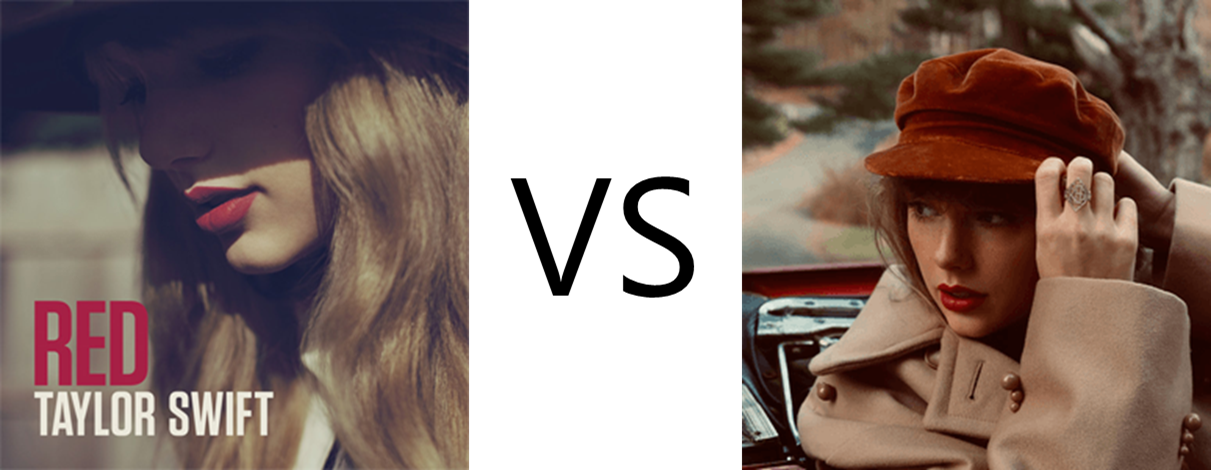
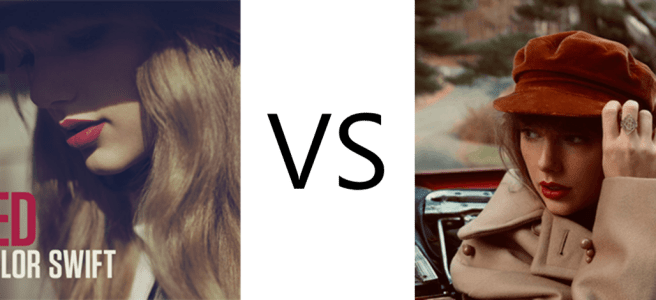
Comparing Taylor Swift’s “Red”: OG vs. TV

(You can access my full ranking and rating of all of Taylor Swift’s songs here!)

How does Red (Taylor’s Version) compare to the original? Taken overall, I think it compares very well. But that doesn’t mean every individual track is better. Here’s my assessment after listening to each back to back.

  • State of Grace: TV. The new version has brighter electric guitars and much clearer vocals.
  • Red: TV. It has crisper percussion (e.g., compare the intros), fuller vocals, and I like the ending better.
  • Treacherous: OG. It’s a close call, but in TV I miss the heavier guitar in the chorus; the song is more poppy and has less depth.
  • I Knew You Were Trouble: OG. The vocals in TV sound off and she sounds much less pained/upset in the bridge. She’s also softened the EDM emphasis of the song.
  • All Too Well: OG. This is my favorite Taylor song so I don’t even know if I can take off the nostalgia glasses, but in the end, I think the OG has crunchier guitars and more emotive vocals in the early bridge.
  • 22: TV. A tough call, but for me it comes down to this: The OG made “22” sound like “swimsuit,” but TV has better enunciation.
  • I Almost Do: TV. Just not my favorite song in either version but the vocals are a bit better in TV.
  • We Are Never Getting Back Together: OG. Lots of changes here. She doesn’t “perform” the vocals as well and the “whees” are weird; the spoken bit also falls flat.
  • Stay Stay Stay: TV. This track showcases how TV is a reimagining of Red as a pop album. She’s shed the country accent but retained the sense of fun.
  • The Last Time: TV. Setting aside my nostalgia for the OG track, TV is better. Gary Lightbody’s voice is more present and feels more in contact with Taylor’s vocals, which gives the song an  “Exile” vibe. The revised instrumentation increases the sense of urgency.
  • Holy Ground: TV. She’s emphasized electric over acoustic guitar, which fits the tonal repositioning of the album.
  • Sad Beautiful Tragic: TV. This is one of my least favorite tracks in all of Swiftdom, but the instrumentals are a bit cleaner on the new version.
  • The Lucky One: TV. The vocals sound less strained on the new version.
  • Everything Has Changed: TV. The OG was great, but the new version makes it feel a bit restrained and claustrophobic by comparison. Swift and Sheeran seem more comfortable and confident, and the result, combined with crisper production, is much more intimate yet also somehow more epic. Maybe the most improved track.
  • Starlight: TV. Taylor seems to bring the fictional storytelling sensibilities, honed during the Folklore/Evermore era, as she reconstructs this track.
  • Begin Again: TV. It’s a testament to the quality of the OG that Taylor made this one such a close match. For the greater maturity in the vocals, I give the nod to the new take, but these are very similar.
  • The Moment I Knew: TV. Right off the bat, the vocals are warmer, the guitar is clearer, and then the chorus hits and the new production makes it even more epic. Taken all together, the sense of sorrow and pain comes through more potently.
  • Come Back… Be Here: OG. I had high hopes for this, the song I consider to be the great sleeper hit of the Red era (not sure we can consider “All Too Well” a sleeper anymore). The TV track somehow loses the soaring passion of the OG, and it falls flat. Compare especially from the bridge on; like some other TV tracks, the emotion just doesn’t feel as raw or real.
  • Girl at Home: TV. The OG is unfairly maligned; it’s OK to have some cheesy fun, isn’t it? The new take reimagines the whole thing and dials the cheesiness up even further, which was a great choice.
  • State of Grace (Acoustic Version): TV. Another track where her vocal maturity shines, turning this into a reflective, emotional powerhouse.

So, bottom line: TV is better than OG. I’m reminded that in 2014, after Daft Punk won the Grammy over Red, Swift skipped the after-parties, “went home and… cried a little bit, and … got In-N-Out Burger and ate a lot.” And then she reflected: “You have a few options when you don’t win an award. You can decide like, ‘Oh, they’re wrong, they all voted wrong.’ Or… you can say, ‘Maybe they’re right — maybe I did not make the record of my career.’ Maybe I need to fix the problem, which was that I have not been making sonically cohesive albums.”

She’s now achieved that sonic cohesion. The original was a bit of an eclectic mix, but with Taylor’s Version, she’s effectively repositioned Red as a primarily pop album (with, yes, a few country flourishes). Yes, some of the big hits don’t land quite as well, but taken all together, they and the other tracks have given life to a more polished work of art.

Delaying the Tenure Clock May Be an Inequitable Response to COVID-19

When I did a Google image search for “equity,” this was the first hit. I’ve seen this sort of picture before, and you probably have too. Given the Interaction Institute for Social Change has made the image freely available for use, it probably has appeared on every university campus in America during some presentation on diversity, equity, and inclusion.

(Interaction Institute for Social Change | Artist: Angus Maguire. interactioninstitute.org; madewithangus.com)

The message of the cartoon is clear: Rigidly identical standards may perpetuate inequity if we don’t account for differences across personal circumstances.

With this in mind, I’d like to consider how universities are approaching the tenure and promotion process during the COVID-19 pandemic. The most common response seems to be allowing assistant professors to extend their tenure clock by a year. However, this may create inequity for those on the tenure track, particularly for those in groups already underrepresented in the professoriate.

Recently, members of the University of Massachusettes ADVANCE team, a group “focusing on offering equitable campus support for faculty members and fostering inclusion amid major shifts to higher education and deep uncertainty about the future,” proposed a series of recommendations for helping faculty navigate COVID. Regarding tenure, they recommended:

Automatically delay tenure, promotion and reviews. Institutions should immediately slow the timing of decisions on tenure and reappointment to account for the new and unexpected tasks faculty members have had to shoulder. COVID-19 has affected research productivity in many ways, resulting in reduced access to labs, travel cancellations and suspension of human-subjects research, among other issues. Tenure delays can help mitigate such negative effects of COVID-19 on women faculty, who are already navigating gender biases in evaluation processes.

https://www.insidehighered.com/advice/2020/09/04/advice-academic-administrators-how-best-support-faculty-during-pandemic-opinion

Let’s break this down. The first sentence observes that tenure-track faculty have encountered novel demands on their time and energy. In other words, assistant professors haven’t been vacationing during the pandemic. At my university, our Provost emphasized in an email to all faculty that the pandemic is “mandating our intense focus on teaching during all of 2020,” acknowledging “our planned progress on scholarship may be slowed.” In addition to whatever demands the pandemic has imposed on their personal lives, assistant professors have set aside research in order to train and transition to distance learning and hybrid classrooms.

Increased teaching workload isn’t the only challenge to research progress. The ADVANCE team notes that assistant professors often receive diminished research support from their universities, as well as more limited opportunities to collect data, present papers, and network with colleagues. For those whose scholarship requires longitudinal research, travel abroad, or field visits, the effect may be so devastating that assistant professors must reinvent their research programs.

Moreover, these burdens aren’t experienced equally across the professoriate. The pandemic appears to reduce the research productivity of women, perhaps because they are more likely to bear household and childcare responsibilities. The pandemic itself has hit ethnic/racial minority communities particularly hard, and faculty from underrepresented groups may face greater barriers to research productivity during the pandemic than their white peers.

Thus, in the classic equity image above, the tall person on the left may represent tenured faculty, who experienced plenty of financial support and opportunities for research without the calamity wrought by a global pandemic. Some fortunate assistant professors may be like the person in the middle, lacking that same support yet possessing research programs and personal privileges that enable them to weather the pandemic’s effects. And other assistant professors, perhaps especially women and members of racial/ethnic minorities, may be so burdened by the pandemic’s demands that they are like the person on the right who can’t see over the fence.

The solution offered by the ADVANCE team is to extend the tenure clock, and the University of Massachusetts isn’t alone in that recommendation. Several universities, including my own, are enacting similar policies (University of Washington, for example). The logic seems to run along these lines: Perhaps the tenure and promotion guidelines recommend ten publications in peer-reviewed journals, but due to the pandemic, an assistant professor will only have eight publications by the time the clock expires. An extra year could make up for the year lost to the pandemic, enabling them to reach that threshold of ten publications.

At first glance, this may appear like equity as depicted in the picture—faculty receive more time than usual, in the hope that after that bonus year they’ll rise to the standard. Although well intentioned, this solution may not work for all tenure-track faculty, and it may facilitate inequity rather than curbing it.

Tenure and promotion mean many things in the life of a professor. Promotion often brings a pay raise, perhaps a substantial one. Beyond finances, obtaining tenure affords status and prestige in one’s discipline. It brings greater freedom to express opinions on controversial matters, both academic and institutional. Of course, it affords job security, which is becoming ever rarer in academia and may be under particular threat during the pandemic.

Delaying tenure means delaying all of these things. Even a retroactive pay bump, which the ADVANCE team suggests, doesn’t fully ameliorate that. Moreover, an extra year on the clock may not be enough to revive research programs strongly affected by the pandemic.

An extra year fails to acknowledge the challenging work assistant professors have already given to their universities. The current cohort of tenure-track faculty, which is more racially diverse than cohorts in the past, has shifted their research to teaching and service, and done so quickly and unexpectedly. Many have done this while navigating increased demands in their personal lives. Resources and opportunities for scholarship are more limited than they were even a year ago. For some, the pandemic may make it difficult or impossible to restart their prior research programs.

And yet their tenured colleagues and administrators, a less diverse group who did not face these challenges, still wants to hold today’s assistant professors to the same standard of productivity. Perhaps that is like the person on the left wondering why the person on the right can’t see the game. Giving a year extension may be like handing that person a pair of binoculars rather than a box on which to stand.

Although a year delay in the tenure clock may serve the interests of some faculty, for others it is an incomplete solution that ‘rewards’ overworked faculty, who may feel the effects of burnout, with the ‘opportunity’ to do another year of work before they receive the fruit of their labor.

A more equitable solution might consider the faculty member’s individual circumstances, including the nature of their research program and the effect of the pandemic on it. Institutions could require faculty members to include a statement about this in their tenure and promotion application (and ask those evaluating the application to consider it). Likewise, external review letters might include that information, as well as guidance on how the pandemic has influenced the institution’s research support and work priorities.

An alternative approach has received little consideration, as far as I can tell: Rather than affording faculty an extra year to reach the standard, perhaps it is time to reconsider the standard in light of our unusual circumstances.

A recent article quoted Dominique Baker, assistant professor of education policy at Southern Methodist University: “What difference does it make if we say, ‘Instead of having 20 publications, you need to have 15’? We have total control over what this looks like, and if we don’t want people to be burned out, why don’t we adjust our expectations a bit in light of what’s happening around us?”

One objection involves the precedent this might create. To that point, for the sake of equity, perhaps we should reconsider standards again if we ever encounter another situation as pervasive, deleterious, and demanding as the pandemic. Another objection could be that relaxing tenure standards may weaken the perceived prestige of the school, but this line of thought conflates research output with faculty quality. When circumstances improve, so will productivity of all faculty.

Some might observe that delaying tenure could help university budgets in the short term during a time of fiscal crisis. Yet balancing institutional finances on the backs of junior faculty would serve as clear evidence of inequity across professional ranks and roles.

During the pandemic, assistant professors have shouldered much of the labor that is keeping universities afloat in these turbulent waters. Considering all possible ways to adjust the tenure process equitably signals to assistant professors that universities value that work. For many, and particularly those from traditionally underrepresented groups, such adjustments could be the stack of boxes that will let them see the game. Without such equity, we risk diminishing the future contributions of an entire generation of assistant professors.

Further report on TCU compensation

During the 2019-20 academic year, TCU’s Faculty Senate endorsed a report finding that TCU’s full-time faculty compensation lags behind other nationally-ranked private universities.

The AAUP recently released new data on faculty compensation, so a subsequent analysis examined that data to see if that was still the case. This analysis also considered data from IRS Form 990 filings to get a fuller picture of compensation across the comparison schools.

The Board of Trustees’ decision to permanently reduce employee compensation (by reducing the retirement contribution rate by over 30%) also motivated the report. An Open Letter expresses faculty/staff concern about this decision, and as of this writing that Open Letter has been signed by almost 40% of full-time TCU faculty.

The full report (which serves as an addition to the 2019-20 Senate report) is available here. TCU 360 has also published an article that summarizes and visualizes some of the data presented in the report.

The report offers the following summary: “The reduction in the retirement contribution further diminishes TCU’s lackluster compensation packages in comparison to other nationally-ranked private universities. In contrast, recent history indicates that TCU has spent lavishly on the compensation of executive and athletic officers, at levels exceeding almost all other comparison schools.”